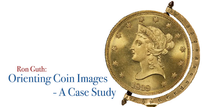
By Ron Guth – The Numismatic Detective Agency …..
One of the more interesting puzzles facing researchers and publishers is how to orient coin images for visual purposes. In other words, how should a coin be oriented or rotated so that it appears consistent throughout a publication or across publications?
For most coins, especially modern ones, visual clues on the coins themselves can be used to come up with a universally accepted orientation. On other coins, especially U.S. coins from the early 1800s, coin orientation becomes trickier.
The author ran into this problem while accumulating coin images for a visual Condition Census (the best examples of a given coin). Different sources sometimes orient coins differently such that each image must be rotated to make them consistent throughout the Census. In order to save even more work in the future, a decision should be made before images are accumulated to determine which orientation should be used.
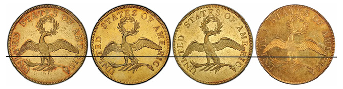
1796 $10 Gold Pieces – which image orientation would you choose?
The illustration above combines the unretouched images of the reverses of four 1796 $10 Eagles shown on the PCGS CoinFacts website at www.pcgs.com/coinfacts (lest anyone think I am picking on PCGS, they actually do a good job at being consistent with their image orientation). For this illustration, I drew a horizontal line through all of the images using the wingtip on the left side of the first coin as a reference point. The wingtips on the second and third coins are slightly lower, but both coins are oriented in nearly identical positions. The wingtip of the fourth coin is well above the line, indicating a rightward orientation.
Which of the four images would you choose as a model for orienting the reverses of 1796 $10 Eagles?
Personally, I prefer the first image because it has a more balanced “look” than the others. The position of the eagle’s feet appears more natural and a horizontal line through the bottom of the U in UNITED almost touches the bottom of the second A in AMERICA. The second and third images appear to be tilted too far to the left and the fourth image is tilted too far to the right.
You might choose a different orientation for your own reason. The key is to be consistent from image to image. Here is what the images look like when they are rotated to the same orientation:
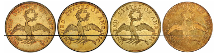
Now their orientations match more closely
Just because I’ve chosen a particular orientation, is it necessarily correct? Does it match the designer’s intent for the coin, meaning that the orientation of the obverse should drive the orientation of the reverse and vice versa? Should the designer’s intent trump all other considerations? Does the designer’s final version even look natural and balanced in the context of other coins of the period?
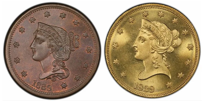
One coin orientation that has always bothered me is the early version of the Braided Hair design as seen on 1839-1843 Large Cents and 1838-1839 $10 gold pieces. Historically, these have been illustrated using the date as a reference point for orientation, which is correct for these types. If we use the orientation of the reverse to judge the orientation of the obverse, then the designer’s intent looks something like this:
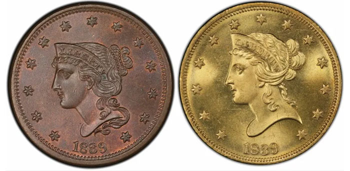
1839 Large Cent and 1839/8 $10 Eagle. Liberty appears to be tipping over.
In these two instances, Liberty’s head is rotated too far to the left to the point where she appears to be tipping over. However, the framing of the date and stars on both coins is consistent. A line drawn through the first and 13th stars is perfectly horizontal. This illustrates the danger of using hard and fast rules for orienting coins.
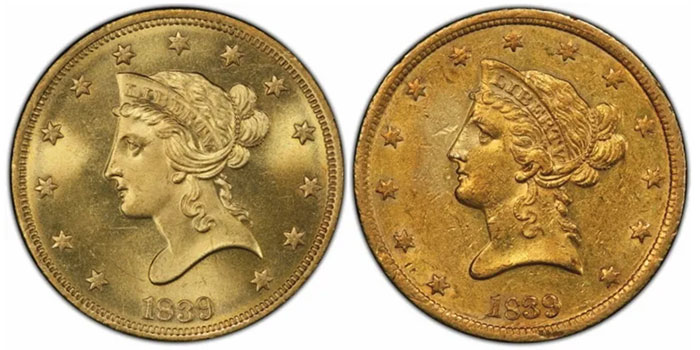
If, for instance, the position of the date drives coin orientation, then we end up with odd-looking orientations such as these. However, even if we orient these coins using a more natural version of Liberty’s head, then we still end up with coins that looks unbalanced, with a date that is way off-kilter.
A more naturally balanced head yields an odd date placement
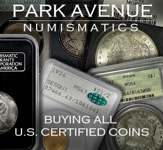
In this instance, we know that this design was “wrong” because it did not last for very long. For example, Half Cents and Quarter Eagles began their lives in 1840 using the new design. On Large Cents, the design held until 1843 when the engravers changed the arrangement of the stars and moved the date under the bust. What is surprising is that the 1839 Half Eagles (the first year of issue) were of the new design, which was in sharp contrast with the 1839 Large Cents and the earliest 1839 $10 Eagles.
Old design (left) versus the new design (right)
But again, when orienting coin images, there is no hard and fast rule. What might apply to Seated Liberty coins may not apply to Classic Head coinage. Even hand-crafted die varieties from the same year can frustrate efforts to orient coins in a like manner. As noted above, simple design modifications can completely alter the way images are oriented.
In future installments, I’ll take a look at general considerations for coin orientation and some special rules that can be used to orient specific coin types.
As always, please leave a comment below and I will do my best to answer them in a timely manner.
Photo credits – all of the images used here are derivatives of images presented on PCGS Coinfacts.


I have a virtually untouched 1964 D mint Jfk half dollar that has the symbol “em2xa” inside the nostril of jfk. Google em2xa it comes up to 1934 codification of federal regulation of rules and laws of exchange and currency. Joeseph Kennedy was named the first chairman of the board the newly created in 1934 SECURITY AND EXCHANGE COMMISION. This would make it a direct connection and reason for it to be part of design as either experimental or a special strike in joe kennedy ‘s honor. It is small and unnoticeable but is plainly seen through magnification on my coin. Other coins have marks in the nose but no one has told me theirs were readable. I will try to send the picture through email. Please take this seriously as others dont respond or try to help me find out about this very unusual coin
Please give me an email address to send pictures. This coin my be the only sms denver mint made. It has the broken rays..the i and B marks of sms…straight fg …straight up and down rim …polishing marks …fingerprint type marks on the neck..some gray flecks in places…D mint mark is doubled..or smudged…lots of die marks on sharp lettering….and em2xa in the nostril.
You can send pictures to news at coinweek.com.